EXCELSIOR EXCELSIOR EXCELSIOR
We don't just build websites. We engineer the AI & systems behind missions worth scaling.
The pride is the unit. Every project is delivered with the precision of an engineer, the conviction of a lion, and the leverage of intelligent systems. This is the soul of the system — before any color, mark, or font.
AI strategy. Intelligent software. Real results. We build for missions worth scaling — agentic systems, custom software, zero friction.
Lead from the Front
Like the lion of the pride, we move first — with conviction, with clarity, and with skin in the game.
Engineered to Amplify
Technology — especially AI — should multiply mission, not replace it. Every system we ship makes the work of changing things for the better easier and faster.
Zero Friction
No black boxes. No surprises. Clean code, clear thinking, and a partnership our clients can feel from the first call.
From Idea to Orbit
We don't stop at launch — we propel. We treat every project as a vehicle for momentum, not a deliverable to close.
One mark. Three surfaces. Zero compromise.
The wordmark is the primary expression of the brand. Treat it with restraint — surround it with space, contrast, and intention. The pride doesn't need to shout.
Don'ts
The mark earns its presence through restraint. Never modify, recolor, or decorate it — if a surface won't take the brand, choose a different surface.
Flame to Rose. A gradient that moves like momentum.
Our primary signature is a hot, directional gradient from Flame to Rose. It is the most expensive element in the system — use it sparingly, and let it carry meaning when it shows up.
Amplify.
From flame to rose.
From idea to orbit.
Primary & Support
Neutrals
Usage Ratios
Default editorial mix. Generous paper, anchored by ink, ignited by gradient.
For interfaces. Neutral surfaces, sharp ink labels, single-shot flame accents.
When the work has to roar. Ink-dominant, with gradient pulled to the front.
A confident grotesque, a working sans, a system mono.
Type carries the brand more than any other element. The default pairing is Signal — below are two alternates we've explored. Use the Tweaks panel to swap globally.
Type Scale
An 8‑point system. A 12‑column page. Predictable rhythm everywhere.
Every spacing decision is a multiple of 8. Every page is built on a 12-column grid with 24px outer margins and 8px gutters. Radii are picked from a fixed set — never freehand.
Spacing scale
Radii
Page grid
Editorial spreads use 8/4 of 12. Card grids use multiples of 3 or 4. Forms break to a 6-column flow on tablets and stack at 480.
Bold without bluster. Technical without coldness. Always pride-forward.
We write like a senior engineer who actually likes the people they're building for. Confident verbs, short clauses, no jargon for jargon's sake.
Direct.
Lead with the verb. Cut the throat-clearing. If a sentence can be 7 words, it shouldn't be 14.
Engineered.
Numbers, specifics, proper nouns. We say "99.99% uptime," not "rock-solid hosting."
Warm.
We write to founders and operators, not stakeholders. Affection for the work shows up in the choice of verbs.
Pride-coded.
Quiet references to the pride metaphor — "lead from the front," "join the pride," "roar online" — used sparingly and never twice in one screen.
We engineer the AI behind missions worth scaling.
Active verb, specific subject, real outcome.
We're a full-service digital solutions partner empowering organizations.
No verbs. No mission. No reason to keep reading.
Beautiful design. Bulletproof code. Real results.
Three beats, parallel structure, earned confidence.
Cutting-edge, best-in-class, world-class solutions, synergized.
Adjective stacking is a confidence vacuum.
to orbit.
from the front.
The Voice Spectrum
The Word Bank
- Amplify
- Build
- Ship
- Launch
- Engineer
- Bulletproof
- Pride
- Roar
- Orbit
- Friction
- Mission
- Impact
- Lead
- Move
- Beautiful
- Real
- Zero
- Specific
- Solutions
- Synergize
- Robust
- Cutting-edge
- Best-in-class
- World-class
- Holistic
- Empower
- Disrupt
- Innovate
- Game-changing
- Revolutionary
- Stakeholders
- Ecosystem
- Optimize
- Streamline
- Pivot
- Leverage
Headline Formulas
Bulletproof code.
Real results.
Just momentum.
from the front.
Microcopy Library
The Channel Matrix
Like a senior partner who picks up the phone
Reviewed the brief — the timeline works. One question: who owns the customer data the agents will read from? That answer changes the model strategy more than anything else.
Quick call Thursday?
— Trevor · Excelsior
Receipts, not posts
8 weeks, idea to live.
Cut ops time by 62%.
The pride moves.
Less than you'd think. More verb than noun.
See how we work
Join the pride
SYS.ID.WEB-DEVELOPMENT
Specifics earn the room
Build: 8 weeks. Three sprints.
Investment: $58,000, milestoned.
Owner of record: Trevor.
Like a senior engineer left a note
Rollback: make db.rollback
Direct. Warm. Stamped.
✓ Shipped agent-ops v0.4
→ Today: eval suite, copy review
⚠ Need: prod traffic sample from Maria
Pride: active.
Email Signature
Real people, real work, real light. Movement that earns the screen.
Photography is documentary, not stock. Motion is purposeful, not decorative — every animation should explain something the page couldn't otherwise.
Motion tokens
A small, sharp toolkit. Built to combine.
The component set is intentionally small. Combine them rather than extending them — new patterns earn their place through use.
Agentic Solutions
Custom chatbots, autonomous agents, and intelligent workflow systems that reduce cost and scale operations.
Ready to start?
Let's talk about how we bring your vision to life and help your brand roar online.
The pride doesn't ship beta.
Every release passes a three-stage QA gate before it touches a live client surface.
One button system. Three voices. Every state covered.
Primary is the gradient — loud, expensive, one per screen. Secondary anchors. Tertiary disappears. Sizes climb from SM to XL; every variant carries the same four states.
Height / Type / Padding-X — every size is on the 4 px sub-rhythm. MD is the default.
Pill radius · 999
Halo 30px below
The small effects that make a page feel like Excelsior.
A curated library of CSS treatments — type, surface, motion, texture. Use them sparingly and intentionally; one or two per screen is the rule. Hover any card that's interactive.
Border
Service Card
Lifts on hover with a flame border and soft shadow.
REV 1.0
Beautiful design. Bulletproof code. Real results. — Excelsior Pride · House Voice
Animation has a job. If it doesn't, cut it.
Motion is structural, not decorative. Every animation should explain something the static page can't — what changed, what's coming, what's interactive. Movement that doesn't earn its frame distracts from the work.
The four jobs of motion
Reveal
Content fades up 28 px on first paint. Tells the eye where to land — once per element, never twice.
React
Hover lifts 2 px, press settles to 0 with a 3% scale. Confirms the system heard you — 150 ms max.
Connect
Old slides up & out; new rises & in. The page never blinks — state changes always have an explanation.
Signal
Slow pulses on live status. Reserved for "this is alive" indicators. Never for decoration.
Timing tokens · Use these. Don't freestyle.
Do & Don't
- Animate transform and opacity only. They're GPU-cheap; layout properties (width, top, margin) cost frames.
- Stagger groups: 60–80 ms between items keeps a list feeling intentional, not robotic.
- Always exit faster than you entered — ~70% of the entry duration. The eye is faster on the way out.
- Respect prefers-reduced-motion — cut durations to 1 ms or replace with cross-fades.
- Anchor motion to the cause: if a button opens a panel, the panel grows from the button.
- Bounce. Spring overshoots are reserved for celebratory moments — not nav items, not cards.
- Auto-play loops over content. Marquees and ambient pulses live on chrome, never under text.
- Animate on scroll just because. Scroll-triggered effects need a reason — otherwise users feel like they're fighting the page.
- Use durations longer than 600 ms for interaction feedback. Anything slower than that reads as "broken."
- Stack more than two simultaneous animations on the same surface. The eye picks one to follow; pick it for them.
Reduced motion · default-on for the system
Always honor the user's setting.
Some of our users have vestibular conditions or simply prefer calmer interfaces. Wrap every motion-heavy rule in @media (prefers-reduced-motion: reduce) and downgrade to a 1 ms transition. The page still works; it just stops dancing.
For ambient loops — pulses, marquees, gradient sweeps — pause them entirely under the reduced-motion query. Static states should never lose meaning when motion is removed.
@media (prefers-reduced-motion: reduce) {
  *, *::before, *::after {
    animation-duration: 1ms !important;
    animation-iteration-count: 1 !important;
    transition-duration: 1ms !important;
    scroll-behavior: auto !important;
  }

  .fx-marquee-track,
  .anim-ambient,
  .fx-sweep {
    animation: none !important;
  }
}
The brand survives the inbox. Two templates — one warm, one cold.
Email is the brand's strictest constraint — no JavaScript, fragile CSS, and a 600 px column. The system reduces to its essentials: gradient bar, Oswald display, Space Grotesk body, single CTA.
One thing we got wrong in April.
Hey there — quick one. Our launch checklist had a blind spot: stage data dumps. We caught it before it bit a client, but only barely. We've rewritten the QA gate around it; here's the full retro.
Onward.
— Trevor & the pride
An AI ops engine in 8 weeks. 62% less time on intake.
For an outdoor education company drowning in inbound emails — we built the agent that reads, routes, and drafts the reply. Read the case study →
See the work →April in three stats.
Newsletter spec
Hi Maria,
The AI ops engine moved from Design into Development this morning. Sprint 03 kicks off Tuesday at 09:00 PT.
Two small items need your eye before then — both linked below. Should take 10 minutes total.
Anything you need from us in the meantime — reply to this email and you'll get a human.
Review the two items →— Trevor · Excelsior
Notification spec
The wordmark roars. The pride watches the flank.
The brand has one official mark — the wordmark — backed by a logomark glyph and a small pride of mascots. The animals are illustration, not identity. They appear in service contexts and editorial moments; they never replace the wordmark.
Business Card · EXC.STAT.001
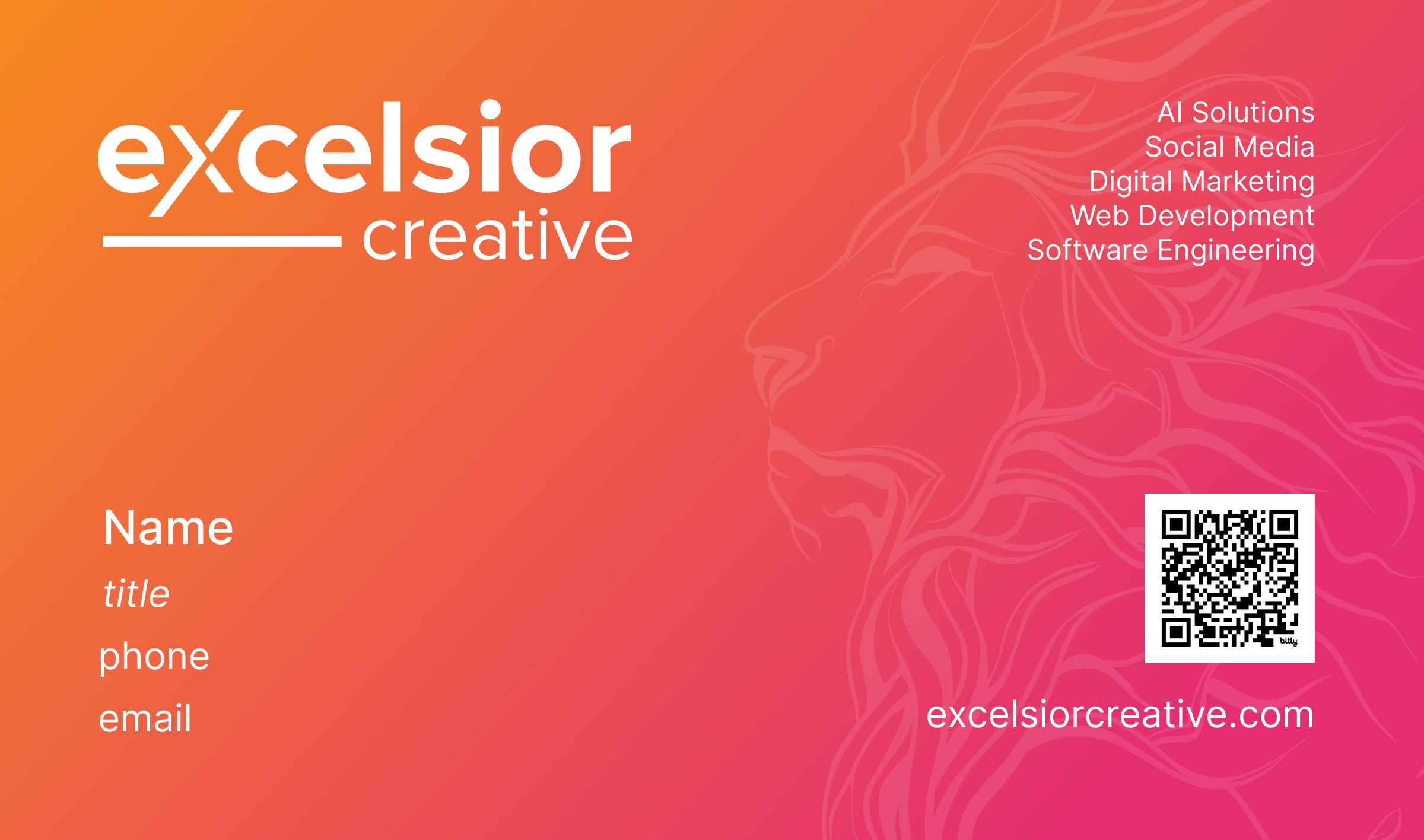
Anatomy
Print at 3.5×2″ on uncoated 16pt stock. The lion sits behind the gradient at 22% opacity — never in front of type, never crossing the wordmark.
Logomark · The "eX" Glyph
A condensed lockup of the wordmark, reduced to the eX ligature for surfaces too small to carry the full wordmark — favicons, app icons, QR badges, mono-line typography.

The Pride · Mascot System
Five hand-drawn animals, each rendered in the brand gradient with the same single-stroke line weight. They represent service families and editorial moments — the lion is canonical, the others rotate. Use one per surface, never multiple.


- Use mascots as illustration — backdrops, accents, divider art. Wordmark always carries identity.
- Pair each animal with its service family. The dragon belongs to AI; the wolf to engineering; the lion is reserved for the pride itself.
- Preserve the gradient stroke. Lion → orange-to-pink, full stroke weight, no fills.
- Anchor mascots off-center, partially cropped. They're characters, not portraits.
- Use the lion at 22% opacity when it sits behind type (business card, deck dividers).
- Recolor the mascots off-gradient. Solid black, solid white, and non-brand gradients are out.
- Fill the line work. They're stroke-only by design — filled silhouettes are off-brand.
- Combine more than one mascot on the same surface. The pride moves alone.
- Use a mascot as a logo lockup. The wordmark is always the primary identifier.
- Animate the mascots beyond a slow opacity fade. Line illustrations don't dance.
Small marks of the system. Used consistently, they become the brand.
The little system tics — SYS.ID., double-slash dividers, status strings — are doing more work than they look like. Here's how they're built.
System IDs
Every primary surface, service, and asset receives a SYS.ID. Format: domain dot category dot slug. All-caps mono.
SYS.ID.AGENTIC-SOLUTIONS
EXC.BRAND.0001
Double-slash dividers
Use // as section markers — in nav, in metadata, in footnotes. They earn the system-aesthetic without resorting to icons.
// ABOUT
// SERVICES — preferred over arrows
Status strings
Triplets of Subject : State, mono, separated by mid-dot. Used in footers, headers, and as long-form chrome.
VISION: FORWARD
LEADERSHIP: ON